We partnered with Jana Seeds, a premium coffee and seed brand, to develop a complete visual identity that feels as refined and organic as the product itself. The brand’s name "جنى" was transformed into a unique Arabic typographic mark, where every curve evokes both the purity of the harvest and the warmth of tradition.
Challenge
Jana Seeds needed a brand identity that would stand out in a crowded coffee and seed market while remaining deeply rooted in Arab culture. The challenge was to express natural quality, artisanal craftsmanship, and product authenticity—without falling into generic or overused visual clichés common in the food and beverage sector.
The client also sought a bilingual design system that could bridge traditional Arabic calligraphy with modern consumer branding, making it equally functional across local and international retail environments.
Goal
Our goal was to design a distinctive visual identity that would reflect the natural purity of Jana Seeds' offerings and resonate emotionally with consumers. We aimed to fuse the Arabic letterforms of "جنى" into a symbolic logo that communicates growth, harvest, and warmth—core to the brand’s values.
By crafting a cohesive system—including logo, color palette, custom typography, and packaging—we sought to elevate Jana Seeds as a premium brand built on cultural integrity and visual elegance.
Result
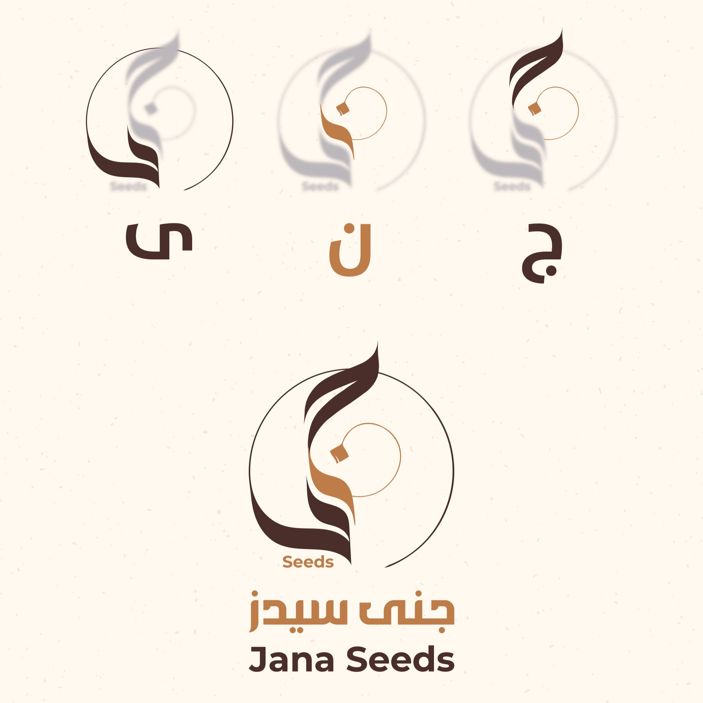
The final identity for Jana Seeds resonated immediately with both consumers and retailers, elevating the brand’s perception from small-batch product to premium, culturally rooted label. The custom Arabic logotype, warm coffee-toned palette, and refined packaging enabled Jana Seeds to secure new points of sale and expand brand recognition across cafes, markets, and online channels.
The project stands as a benchmark for how regional authenticity, when executed cinematically and precisely, can translate into strong commercial and emotional impact.
Shaping comprehensive brand narratives for enduring impact.